
How I designed one user interface to serve three personas?
At Rise Interactive, I was working on a data analysis software aiming to help digital marketers find insights in data and assist their strategy development.
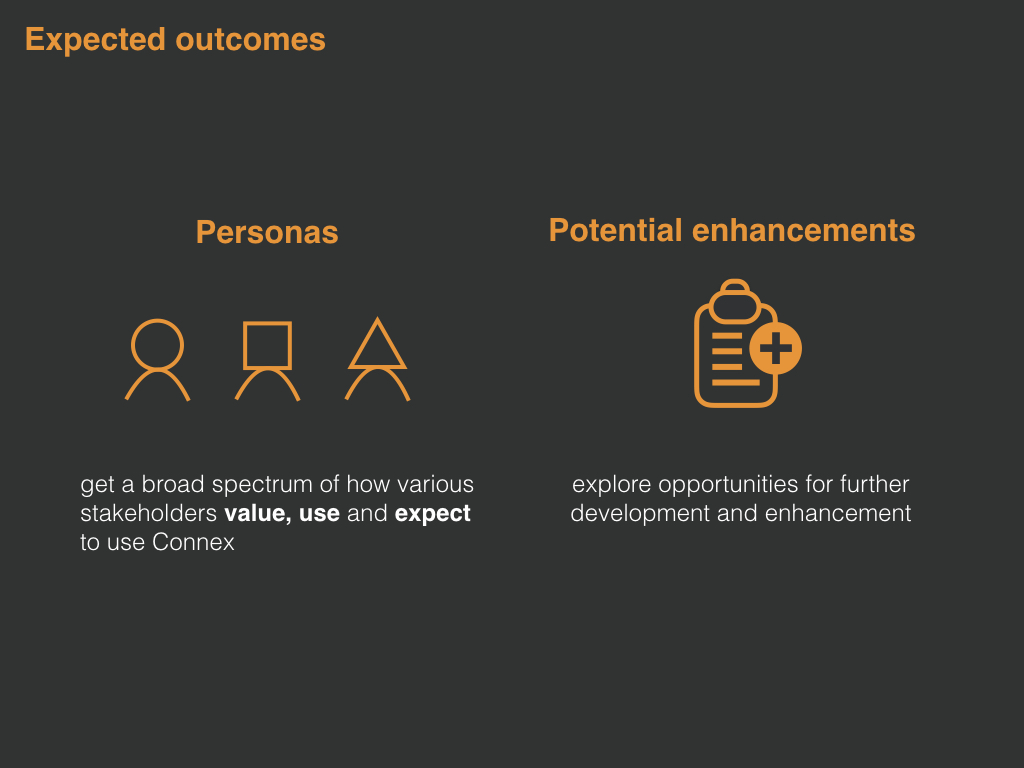
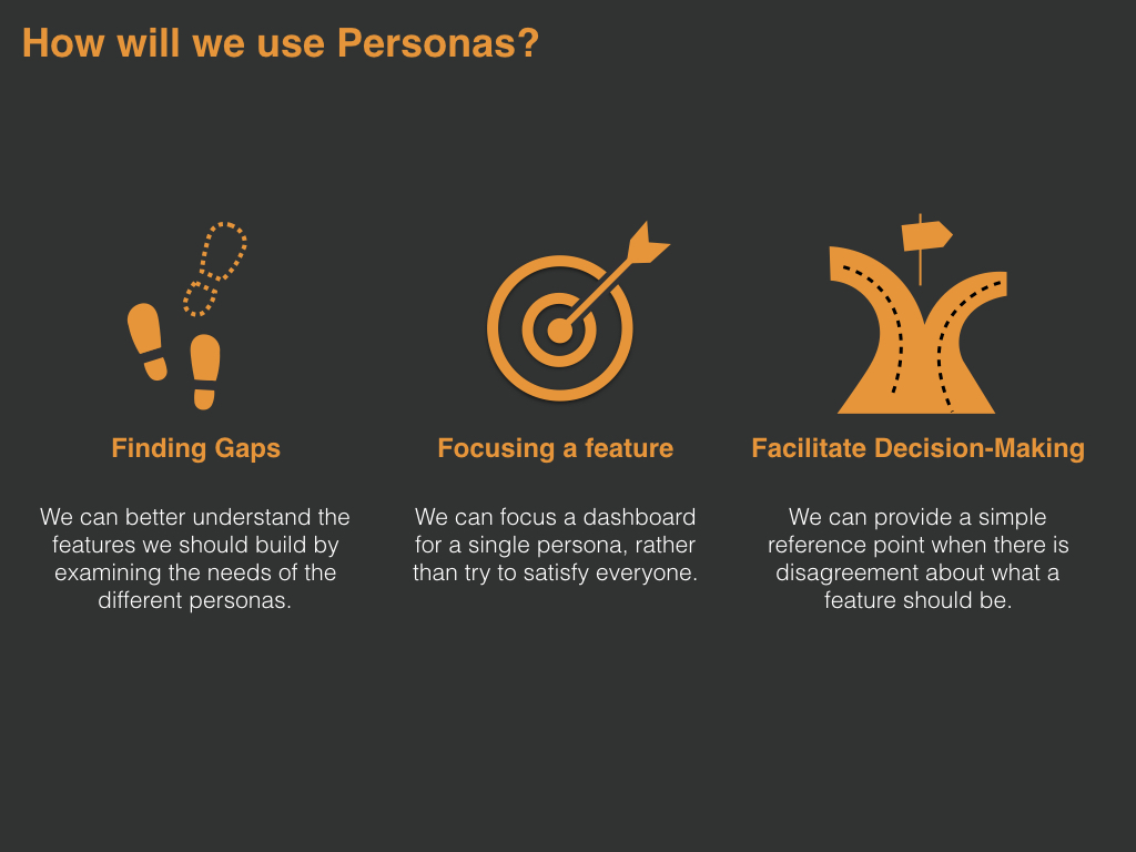
1. Why we need the personas?
I felt the urgent to build some personas for our product.
As I joined the Innovation team at Rise, I started to design a product for digital marketers without any marketing knowledge, without fully understanding my users work and needs. Then in the first three months, I participated in lots of discovery meetings, which ended up with unfocused discussion because of ta lack of clear image of our users. And I was eager to understand the deeper "why"s.
- Why are we building this product?
- Why would our users need this feature?
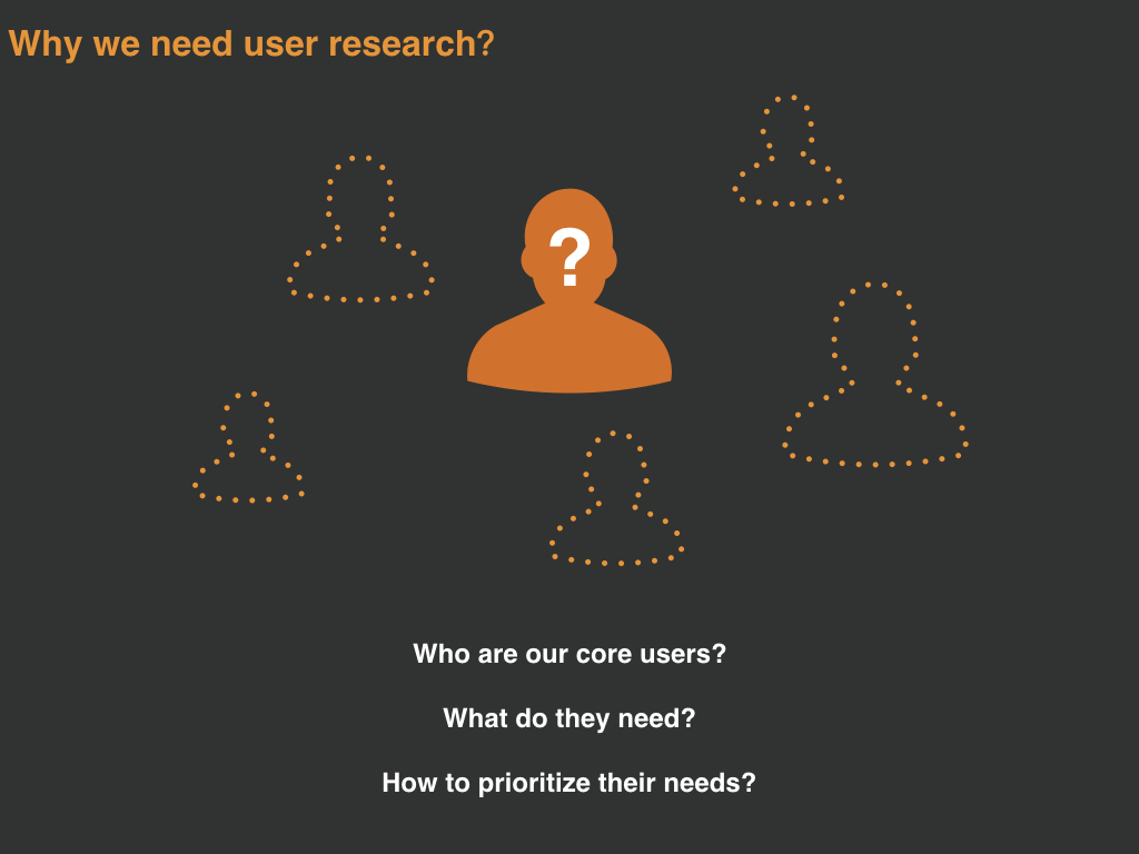
I proposed the first user study project to answer the questions of:
- Who are our core users that we are designing for?
- What do they need?
- How to prioritize their needs?
2. How did I build the personas?
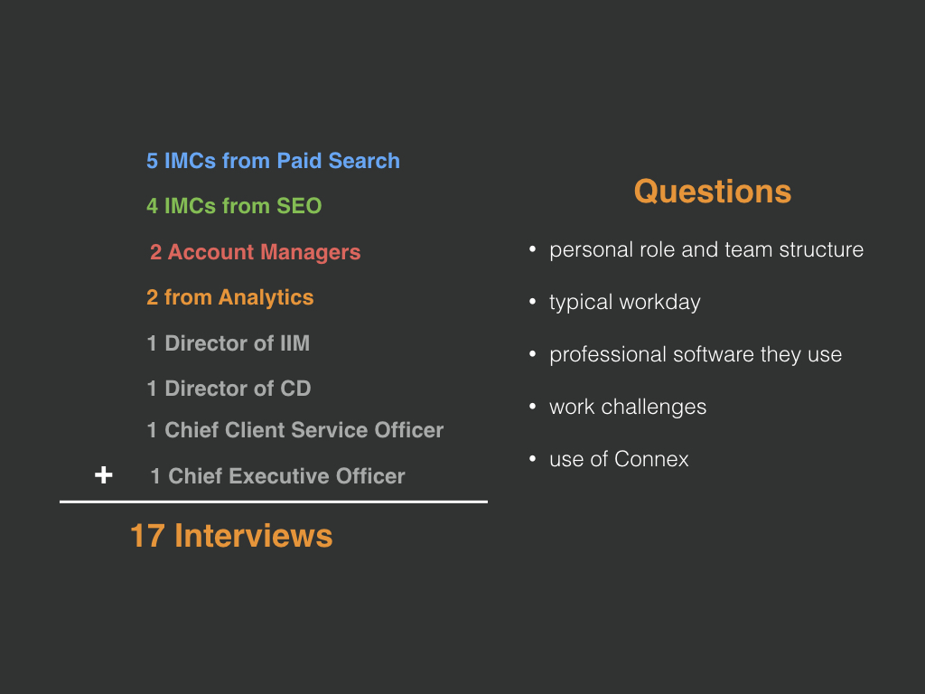
Step 1. Interview Design
Our user interview started with questions about daily habits, then leading participants to self-reflection, covering perspectives on:
- personal role and team structure
- typical workday
- professional software they use
- work challenges
- use of our product
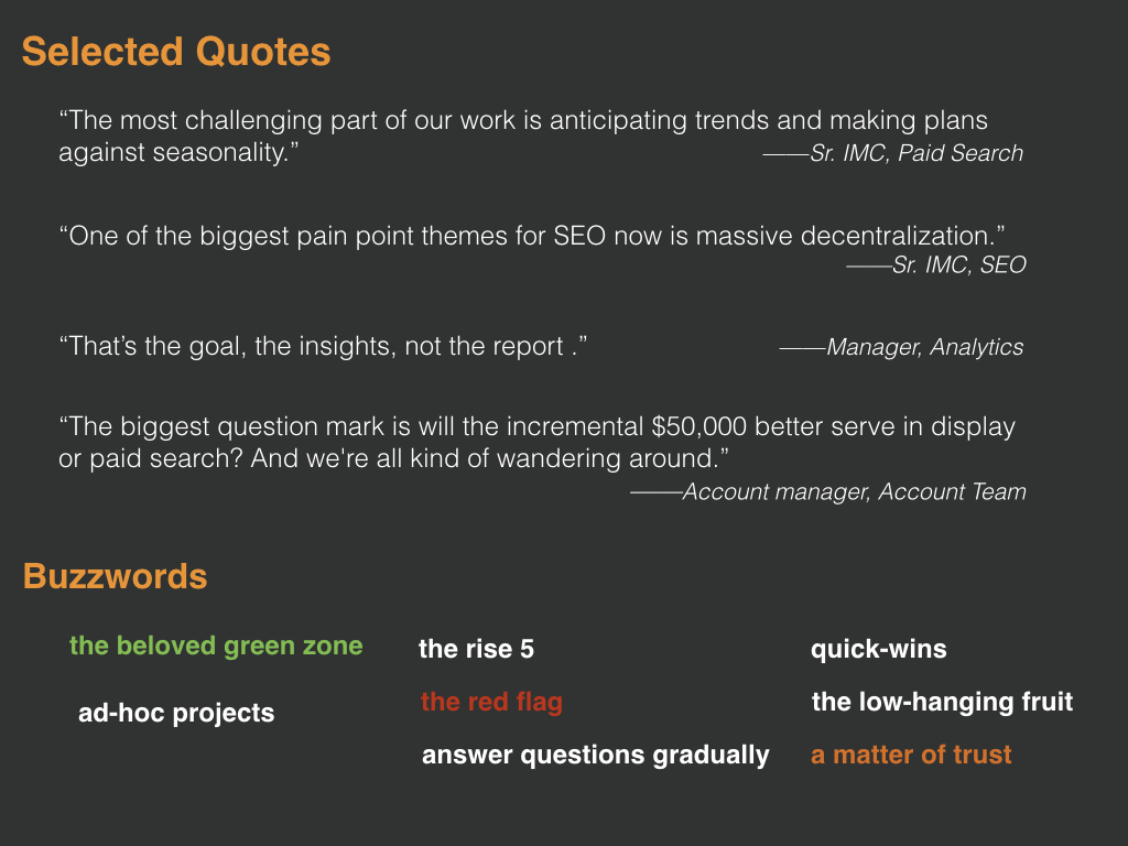
We also designed engaging activities to get abstract concepts from our participants:

Activity 1: What are the criterias value to you for an ideal tool? How would you prioritize them?

Activity 2: What kind of tool do you need to facilitate your work?
Step 2: Coding and analyzing data
Here shows an example of how I analyzed different user priorities for an ideal tool:


Step 3: Story-telling and Share with the Team
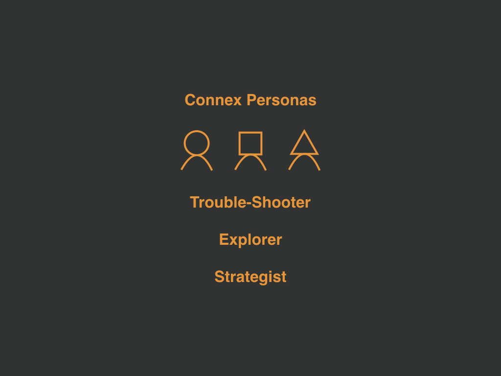
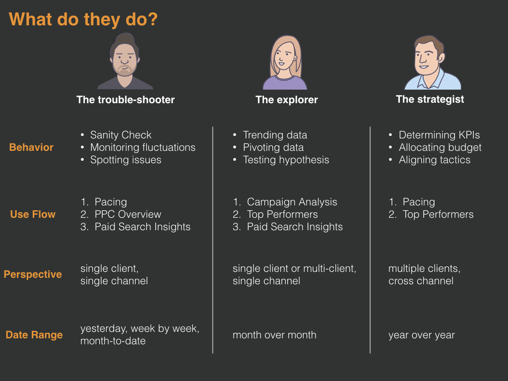
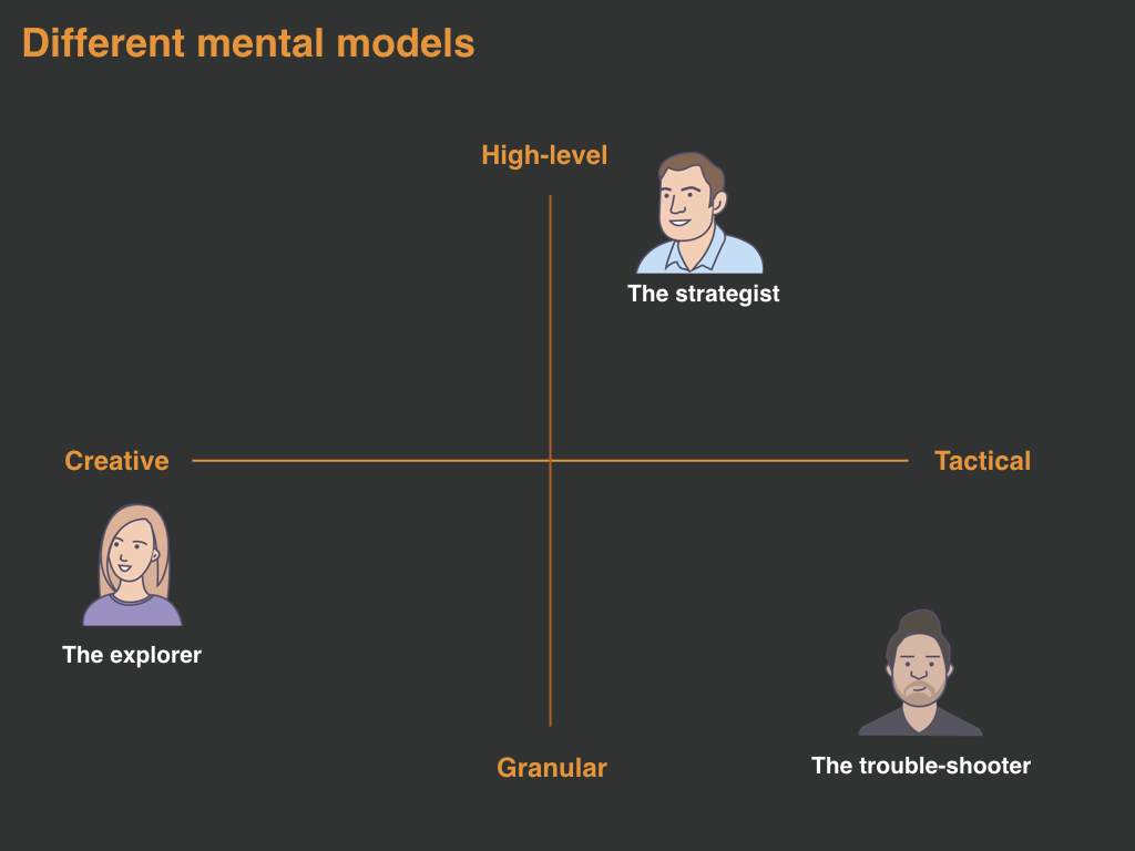
3. How we designed the user interface for 3 personas?

The key to the answer is to clarify information hierarchy.
Here demonstrates one dashboard I designed, consisting of three parts:
- Dual Axis Chart
- Key Measurement Widgets
- Suggestion Table
I designed an interactive chart to feed different information to each type of users.

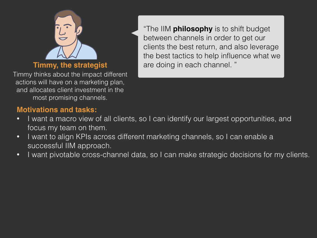
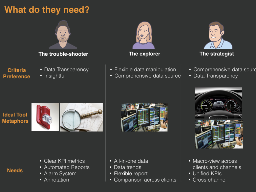
For Strategist, they need information about:
- Macro-view across clients and channels
- Unified KPIs
- Cross channel
So the design provides them high-level status information with color coding.


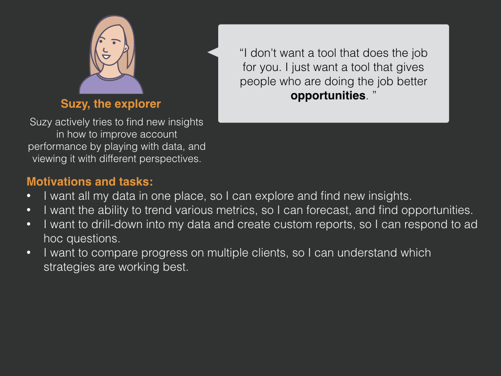
For explorer type of users, they need information about:
- All-in-one data
- Data trends
- Flexible report
- Comparison across clients
So the design offers them data tables at the back of each widget.


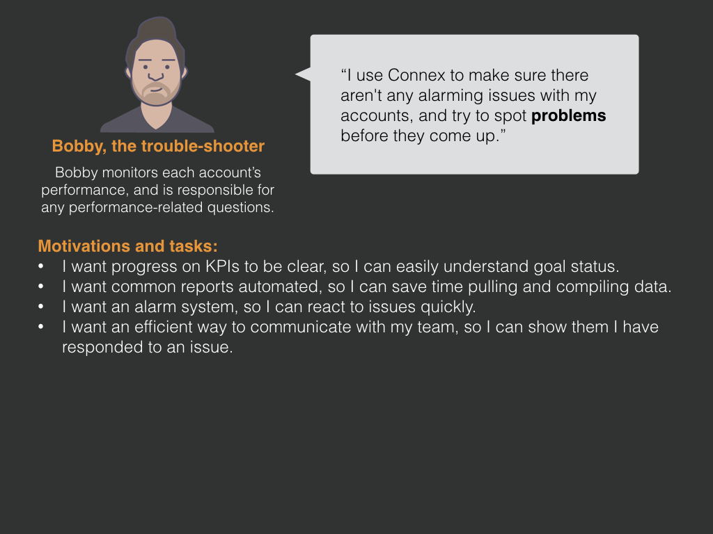
For trouble-shooters, they look for information about:
- Clear KPI metrics
- Automated Reports
- Alarm System
- Annotation
So the design meets their needs with interactive bar chart.


More about my design process


